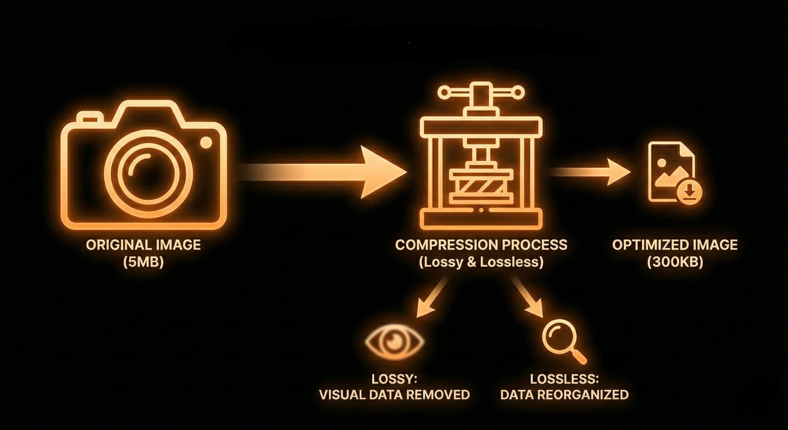
A picture is worth a thousand words, but a 5MB picture is worth a thousand lost visitors. In the world of web performance, large, unoptimized images are the primary culprit for slow load times. This not only frustrates users but also hurts your SEO rankings, as Google prioritizes fast-loading sites.
The good news? You don't have to sacrifice visual quality for speed. With the right tools and techniques, you can reduce file sizes significantly while keeping your images crisp and professional. Here is your comprehensive guide to optimizing images for the web.
"Performance is a feature. An optimized image isn't just smaller; it's a better user experience."
1. Choose the Right File Format
Not all image formats are created equal. Choosing the wrong one is the most common mistake. Here’s a quick breakdown:
- JPEG: Best for photographs and images with complex colors. It uses "lossy" compression, which is great for shrinking file sizes but can introduce artifacts if overdone.
- PNG: Ideal for graphics, logos, and images requiring transparency. It uses "lossless" compression, meaning no quality is lost, but file sizes are generally larger than JPEGs.
- WebP: The modern standard developed by Google. It offers both lossy and lossless compression and is typically 25-35% smaller than comparable JPEGs and PNGs. Use this whenever possible.
- SVG: Perfect for icons and logos. These are vector-based, meaning they scale infinitely without losing quality and have tiny file sizes.

2. Compression: The Secret Sauce
Compression removes unnecessary data from your image file. There are two main types:
Lossy Compression
This method permanently removes some data. It offers the biggest reduction in file size. When done correctly (e.g., reducing quality to 80%), the visual difference is imperceptible to the human eye, but the file size can drop by 60-80%.
Lossless Compression
This compresses the file without removing any pixel data. The file size reduction is smaller (around 10-20%), but the image remains identical to the original. This is best for technical diagrams or medical imaging where detail is paramount.
3. Resize Images to Display Size
Never upload a 4000px wide image if it will only be displayed at 800px wide. The browser still has to download the massive file and then shrink it down, wasting bandwidth and processing power.
- Crop and Resize: Use a photo editor to resize your image to the maximum width of your website's content area (usually between 800px - 1200px).
- Responsive Images: Use the `srcset` attribute in HTML to serve different image sizes to different devices (e.g., a smaller version for mobile, a larger one for desktop).
4. Tools of the Trade
You don't need to be a Photoshop wizard to optimize your images. There are excellent tools available:
- TinyPNG / TinyJPG: A fantastic free online tool for smart lossy compression.
- Squoosh.app: A Google-developed tool that lets you visually compare different codecs and compression levels in real-time.
- ImageOptim (Mac): A drag-and-drop desktop app for lossless compression.
- WordPress Plugins: Tools like Smush or EWWW Image Optimizer can automatically compress images as you upload them to your site.
5. Lazy Loading
Finally, implement "lazy loading." This technique defers the loading of images that are off-screen until the user scrolls down to them. This dramatically improves the "Time to Interactive" metric, as the browser focuses on loading the critical top-of-page content first.
By mastering these optimization techniques, you ensure your website is fast, sleek, and ready for users on any device or connection speed.